Welcome
This is the start of my technical portfolio. Explore the Chart Studio or Model Builder below to interact with the platform, or read on to learn how it works.
Includes an AI analyst that explains trends, correlations, and key events across your charts.
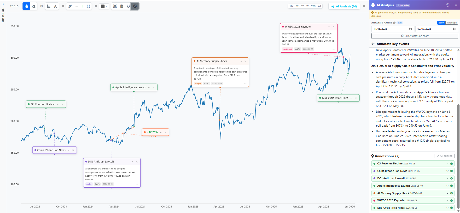 Example: Click to enlarge
Includes an AI assistant that can build a pipeline from a description, scrutinise it, and describe it.
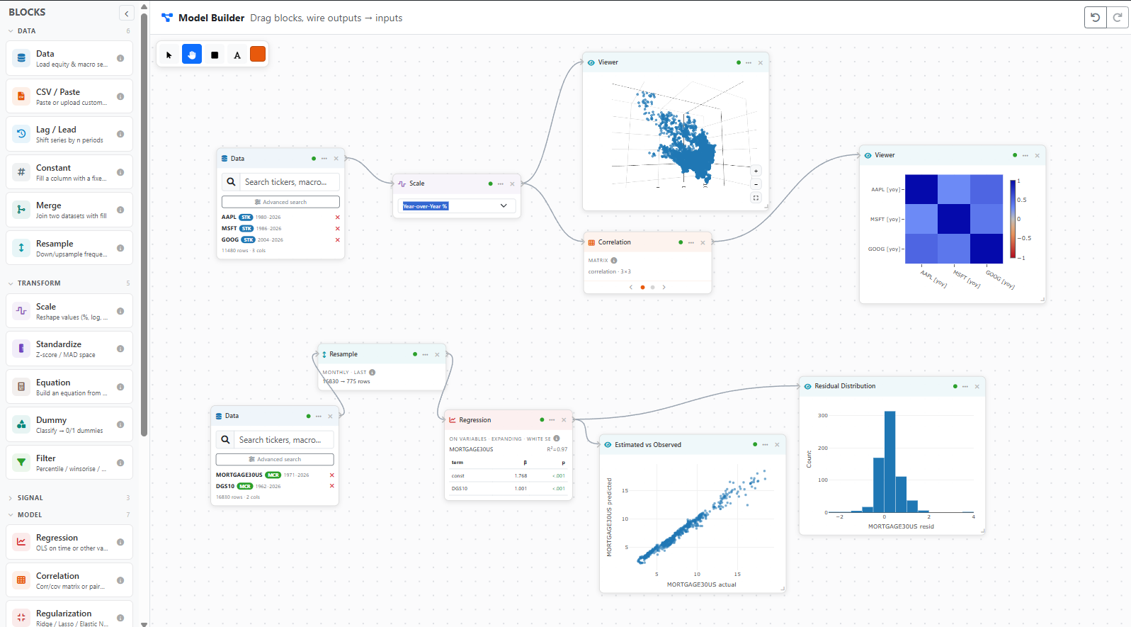 Example: Click to enlarge
How It Works
The platform follows a containerised microservice architecture. A reverse proxy handles TLS termination and request routing, forwarding traffic to the application server. Persistent state is managed by a relational database, while an in-memory store provides low-latency caching and rate-limit enforcement. Background workers handle scheduled data ingestion tasks independently of the request cycle.
The charting engine is a custom Canvas-based rendering system. It employs a layered architecture in which each visual concern — axes, data series, annotations, and user interaction — occupies its own rendering pass. Mathematical transformations (temporal and linear scaling, domain computation, coordinate projection) are delegated to a dedicated scale library, while the rendering itself uses hardware-accelerated 2D canvas operations to maintain responsive frame rates across large datasets.
The platform ingests time series data from multiple upstream providers and normalises it into a uniform representation for the chart engine. A multi-tier caching strategy balances response latency against upstream API constraints. The integrated search engine indexes over 100,000 financial instruments and supports full-text queries with faceted filtering.
The platform incorporates a large language model as a streaming analysis engine. Given the user's charted data and a selected analytical question, the system constructs a context-aware prompt, streams the model's response in real time, and extracts structured annotations that are rendered directly on the chart. The model is augmented with web search grounding to reference named economic events and geopolitical developments.
A step-by-step walkthrough of how to use the Chart Studio, from loading data through to AI-powered analysis.
Loading & Configuring Data
Use the search bar in the left sidebar or the navbar to find equities (e.g. "AAPL"), macro indicators (e.g. "GDP", "CPI"), or international data. Results show the instrument name, data source, and frequency.
Click on a search result to add it. Each series appears in the sidebar with a colour swatch, its ticker, and a human-readable name. You can add up to 6 series simultaneously.
For each series, select a transform (raw value, percentage change, log scale, z-score, cumulative return, etc.) and assign it to the left or right axis. Change the series colour by clicking the colour swatch.
Use the date pickers in the sidebar to narrow the analysis window. Press Update Chart to reload data within the selected range.
Navigation & Annotation Tools
Use the scroll wheel to zoom in and out. Click and drag on the chart to pan. The Reset View button (compress icon in the toolbar) restores the original viewport.
Select the Measure tool (ruler icon) or press M. Click two points on the chart to see the absolute change, percentage change, and number of days between them.
The toolbar provides Line, Horizontal Line, Vertical Line, and Rectangle Shade tools for manual annotation. Use the colour picker to change the drawing colour. The Text tool places editable labels directly on the chart.
Select the Eraser tool then click on any annotation to remove it. The Clear All button (trash icon) removes all measurements and drawings at once.
AI Analysis
Click the Analyze button on the far right of the toolbar. The analysis panel opens showing available question types and a daily usage quota.
The analysis panel has its own date range that defaults to the chart's range. You can narrow it further using the date pickers or the crosshair picker (target icon) to click start and end dates directly on the chart.
When multiple series are loaded, use the series toggles to include or exclude specific instruments from the analysis. Choose between Bullet (concise points) and Paragraph (detailed narrative) output formats.
Click on one of the available question types (e.g., "Trend Summary", "Divergence", "Market Regimes", "Key Drivers"). Some questions require a minimum number of series. The AI streams its response in real time, and any identified annotations — event markers or shaded regions — are automatically applied to the chart.
Expand each annotation card in the panel to read its descriptive blurb and category. Individual annotations can also be toggled or applied manually. Previous analyses are preserved in the History dropdown for quick reference.
Saving & Loading Charts
In the sidebar under "Saved Charts", click + New Chart, enter a name, and press save. This stores all loaded series, date range, annotations, drawing objects, AI analysis history, and the current zoom/pan viewport.
Click the load button next to a saved chart to restore its full state. After making changes, click the save button on the same row to overwrite it with the current state. Use the pencil icon to rename, or the delete button to remove it.
The Model Builder provides a visual node-based editor for constructing complex financial data pipelines. It uses a Directed Acyclic Graph (DAG) evaluation engine to parse and execute models composed of interconnected data streams, mathematical filters, and machine learning components.